Friday 28 February 2014
Audience Feedback on first video draft
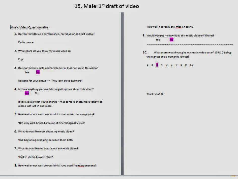


I chose to get my audience feedback from two people outside my target audience age range and four people from with in my target audience. I did this to get a wider range of people giving feedback, to see what the older generation think to.
Friday 14 February 2014
Record label I have used for my CD
Def Jam Recordings

Def Jam are an American record label who are owned by Universal Music Group. It was also founded in 1983 by Rick Rublin. However they are not just based in America, they also are over here in the UK and use the name 'Def Jam UK'. Although in the UK they are operated by Virgin EMI.
I decided to use Def Jam as my record lable because 'Rihanna' is signed with them and my chosen song is by 'Rihanna'. Also since they have a company in America, that is based in New York City and have distributers over here in the UK, my CD would get promoted to a mass range audience and not just only over here in the UK.
2nd Draft of Promotional Poster

This was my second promotional poster which I think doesn't look very good and doesn't catch your eye, which a promotion needs to do. It looks too simple and is all in black and white with no colour. I think it could look better if I added colour and had more information on it, it needs to be more detailed. I do like the main image I used for the poster but it takes away from the CD cover which I am trying to promote.

First Practice Digipak- CD and Promotional Poster


This is my first draft for my CD and magazine promotional poster. I have chose to use similar images for both so that my audience can see that the poster links with the CD. For the white rose images I used, I got off google from this website: http://fin6.com/2013/09/white-rose-image-2014/. I thought that the softness of the rose would link in with the rest of my images and that the texture of it would look good on a CD. When editing the photos of my talent I changed the levels and curves on Photoshop and for my poster image I changed it into black and white to give a different contrast to the coloured image that I have used for the CD album cover. I also changed the Hue and Saturation to make the images lighter/softer, then put a photofilter over the top to brighten it up and give it a hint of colour rather than it being so white. When editing the sky for the back of the album cover I changed the levels to brighten up the sky and make it more blue and the clouds more white.
There are still many improvements I need to make to my Digipak.
Improvements:
- Change the photo for my poster and make it a full length shot, but still have it soft with the same lighting to makle it match up
- I'm not going to use the image of the sky for the back cover but another image of my talent
- I need to add more to my poster so it is not so simple- I need to make it stand out more


Subscribe to:
Posts (Atom)